How to make a button click effect in CSS
Here you’ll learn how to make the button press-in effect in CSS. We’ll tell you ahead of time that there’s nothing complicated here, any beginner will be able to cope with it.
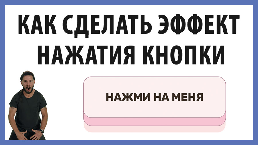
Example
What we end up with (click the button):
What do we need to know? You must know what a pseudo-element is (:before and :after) and what pseudo-classes are (:hover, :active). You should understand how to add a shadow to an element and how you can move the element with the transform property.
Writing the code
So let’s get started.
Let’s create our button in HTML:
<button class="btn">Press on me</button>Now, let’s move on to configuring the CSS. First, let’s rewrite the properties of button, which are set by default:
button {
  position: relative;
  display: inline-block;
  cursor: pointer;
  outline: none;
  border: 0;
  vertical-align: middle;
  text-decoration: none;
  font-size: inherit;
  font-family: inherit;
}
Now you can move on to the visual appearance of the button. Let’s set the text color, background, border, padding, and other little things.
button.btn {
  font-weight: 600;
  color: #382b22;
  text-transform: uppercase;
  padding: 1.25em 2em;
  background: #fff0f0;
  border: 2px solid #b18597;
  border-radius: 0.75em;
  transition: transform 0.15s;
  transform-style: preserve-3d;
}
So, we should get our button like this:

So far, nothing special. But let’s move on to pseudo-elements. Let’s add :before
button.btn::before {
  position: absolute;
  content: "";
  width: 100%;
  height: 100%;
  top: 0;
  left: 0;
  right: 0;
  bottom: 0;
  background: #f9c4d2;
  border-radius: inherit;
  box-shadow: 0 0 0 2px #b18597, 0 0.625em 0 0 #ffe3e2;
  transform: translate3d(0, 0.75em, -1em);
  transition: transform 0.15s, box-shadow 0.15s;
}
And now we have a button with a 3D effect. We set the pseudo-element with background and shadow, which allowed us to achieve this effect. We also lowered it just below the main frame of the button. This is what we got:

Now let’s make a press-in effect when hovering over the button. It will be pressed in slightly, not entirely.
To do this, we lower the main frame below by changing its background a bit and slightly reducing the shadow (box-shadow) for the pseudo-element:
button.btn:hover {
  background: #ffe9e9;
  transform: translate(0, 0.25em);
}
button.btn:hover::before {
  box-shadow: 0 0 0 2px #b18597, 0 0.5em 0 0 #ffe3e2;
  transform: translate3d(0, 0.5em, -1em);
}
A button like this comes out (hover over it!):
And the final touch, let’s change the styles in condition :active
button.btn:active {
  background: #ffe9e9;
  transform: translate(0em, 0.75em);
}
button.btn:active::before {
  box-shadow: 0 0 0 2px #b18597, 0 0 #ffe3e2;
  transform: translate3d(0, 0, -1em);
}
When the button is active (the user has clicked it), we move the main part of the button slightly and remove the shadow.
That’s it, the button press-in effect is ready!
Final code
See the Pen How to make a button click effect in CSS by kirill (@kirivaha) on CodePen.