How to make a smooth zoom of the image on hover – effect on pure CSS
After reading this article, you’ll learn how to make the image smoothly zoom when you hover the mouse. And not just increase in size, but create a zoom effect.
We will only use HTML and CSS. We won’t need any JavaScript.
So, let’s write some html code. We will put our image img in a block with the class photo
<div class="photo">
  <img src="https://webgolovolomki.com/wp-content/uploads/2020/11/hover-img.jpeg">
</div>
I’m not adding any additional classes to the image here so as not to confuse you when explaining it. But on your project, it would be better if you add some own class to the img tag and call the image by this class.
Next, let’s move on to css. With the pseudo class hover we will be able to change the values of the properties.
In this case, we will enlarge the image by changing its transform property. Let’s write it in the code:
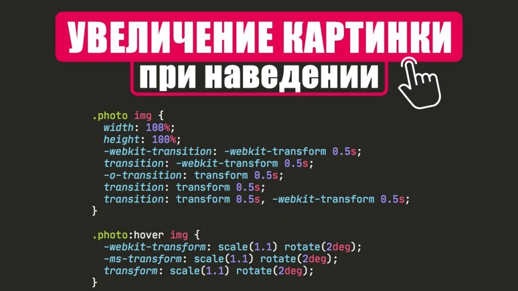
.photo:hover img {
  transform: scale(1.1);
}
Here we have the following explanation: when you hover a block containing a picture (class photo), we change the transform value of the image itself (img).
The Scale value is how much we scale the picture. The default value is 1.
To add a little smoothness to the transition, add the transition property for the img tag
img {
  transition: transform 0.25s;
}
Here we specified which property we were going to change and how long the transition would last.
Now the picture is zooming smoothly, but it’s outside of its conditional frame. To fix this, we need to add the overflow property to the photo block with the value hidden
.photo {
  overflow: hidden;
}
It’s like we’re saying: everything that goes beyond this block, we hide.
But that’s not all, because the browser doesn’t know the size of our block – so we need to set it. And for the image, we have to make sure that it takes up the full width and height of the photo block.
You end up with a code like this:
.photo {
  width: 400px;
  height: 350px;
  overflow: hidden;
}
img {
  transition: transform 0.25s;
}
.photo:hover img {
  transform: scale(1.1);
}
Example of work:
See the Pen How to make a smooth zoom of the image on hover – effect on pure CSS by Pelegrin (@pelegrin2puk) on CodePen.
I hope you have understood the principle by which you can make a smooth zoom of the image on hover. I will attach our video, where I once again explain everything in detail.
возможно ли таким же незамысловатым способом сделать уменьшение картинки когда отводишь курсор? заранее благодарю!!
Супер!!!
Искал так долго во всяких виде… тут сел и сделал за 3 мин.
Мені сподобалась задачка, затупив і не глянув що вер і низ)) на уважність)) 😁 більше таких цікавих речей незавадить))