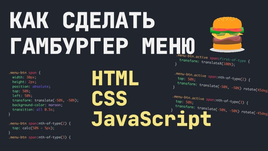
How to make a burger menu – complete code and detailed explanation
This is quite a popular request – how to make a hamburger menu. I will show you a variant using HTML, CSS and JS. This is an adaptive variant, which means it will work on mobile devices as well.
Let’s start by creating the HTML markup. Let’s write the Header and add our burger “icon” inside (it’s just three span elements):
<header>
	<div class="menu-btn">
		<span></span>
		<span></span>
		<span></span>
	</div>
</header>
Now let’s add our menu, which will appear when the user clicks on the hamburger:
<div class="menu">
	<nav>
	   <ul>
		<li><a href="#">Home</a></li>
		<li><a href="#">About</a></li>
		<li><a href="#">Services</a></li>
		<li><a href="#">Contacts</a></li>
	   </ul>
	</nav>
</div>
Now let’s add styles for the Header and for the button:
header {
	display: flex;
	justify-content: flex-end;
}
.menu-btn {
	width: 30px;
	height: 30px;
	position: relative;
	z-index:2;
	overflow: hidden;
}
.menu-btn span {
	width: 30px;
	height: 2px;
	position: absolute;
	top: 50%;
	left: 50%;
	transform: translate(-50%, -50%);
	background-color: #222222;
	transition: all 0.5s;
}
.menu-btn span:nth-of-type(2) {
	top: calc(50% - 5px);
}
.menu-btn span:nth-of-type(3) {
	top: calc(50% + 5px);
}
Right now it looks like this:

The menu doesn’t look good. Let’s fix that by adding some styles:
/* Menu that will appear */
.menu {
	position: fixed;
	top: 0;
	left: 0;
	width: 100%;
	height: 100%;
	padding: 15px;
  background: #FFEFBA;
	transform: translateX(-100%);
	transition: transform 0.5s;
}
.menu.active {
	transform: translateX(0);
}
.menu li {
	list-style-type: none;
}
This is the logic: Now we’ve hidden the menu off the screen with the transform property and the value translateX(-100%);
But when you click on the burger icon, we will add class .active to the menu – and it will return the menu to the visible area of the screen using transform: translateX(0);
Now we need to add this class to the menu (.menu) by clicking on the burger (.menu-btn) in JS :
let menuBtn = document.querySelector('.menu-btn');
let menu = document.querySelector('.menu');
menuBtn.addEventListener('click', function(){
	menu.classList.toggle('active');
})
We use toggle – to remove the class on click, if the item has one. So when we click on a hamburger, the menu appears and disappears.
If you want the menu to appear on the right, change the following property of the menu class:
transform: translateX(100%);
In fact, we have the burger menu ready. And now we need our “icon” turns into an X when you click on the hamburger.
We will use the same trick of adding a class for this. First, we’ll add the CSS:
/* Changing the burger icon when the menu is open */
.menu-btn.active span:nth-of-type(1) {
  display: none;
}
.menu-btn.active span:nth-of-type(2) {
  top: 50%;
  transform: translate(-50%, 0%) rotate(45deg);
}
.menu-btn.active span:nth-of-type(3) {
  top: 50%;
  transform: translate(-50%, 0%) rotate(-45deg);
}
And now in the JS code let’s make a switch, as we did earlier for the menu. Now we’ll do it for the “icon”. It goes like this:
let menuBtn = document.querySelector('.menu-btn');
let menu = document.querySelector('.menu');
menuBtn.addEventListener('click', function(){
	menuBtn.classList.toggle('active');
	menu.classList.toggle('active');
})Now you understand the principle which can help you to make a burger menu. There are many variants of implementation, send your solutions in the comments.
I’m attaching a video from our YouTube channel, you can watch it all in video format:
Спасибо за код.
А как сделать, чтобы меню скрывалось по клику на любой пункт меню, а не только по крестику?
Повесьте на ссылки обработчик на клик. Если у бургера есть класс “active”, то пусть при клике на ссылку он убирается.
Добрый вечер! Что делать, если сначала идет крестик, как-будто бы бургер уже нажат изначально. как исправить? Помогите, пожалуйста.
Как сделать так, чтобы гамбургер срабатывал и на телефоне, а то он только на пк работает
Медиазапросы используйте
код адаптивный – работает и на десктопе, и на мобильном девайсе
как закрыть менющку кликом с любой части страницы а не только кликом на него самого ??? )
За допомогою js. Ось відео, які допоможе зрозуміти: https://youtu.be/pGMoJD89uMY
Добрый день, а как его можно спрятать при большом расширении, а когда при мобильно версии отобразить? с помощью display: none в основном css и при адаптировании display: block?
Так, це норм варіант 👍🏻
При нажатии на бургер меню скрывается, а сам бургер смещается в центр страницы. Как это исправить?
Володимир, добрий день!
Сподобався Ваш урок, але є питання. Я спробував зробити з Вашим прикладом подкатегорії за допомогою псевдокласу hover і нічого не виходить.
Зможете допомогти?
Добрий день. Так, відправте ваш код, глянемо.
Здравствуйте. А как сделать так, чтобы при нажатии на гамбургер, крестик не появлялся, и просто меню выпадало вниз? То есть бургер должен оставаться иконкой….
.menu {
display: none;
}
.menu . active {
display: block;
}
копирую в Вижуал код
подключаю css js и не работает?
есть идеи почему?
Код не валідний. Батьком li не може бути nav
дякую за уважність, так пропустив тег ul
Благодарю! Всё без воды и предельно ясно. Для новичка — самое то! Продолжайте в том же духе.
Спасибо, очень помогло при создании гамбургера, все доступно и ясно описано, буду дальше читать данный сайт.
Благодарю! Очень помог Ваш код разобраться с темой “гамбургер-меню”. Смотрела другие примеры, но они были слишком запутанными и сложными, и, когда пыталась их применить в своём проекте, не всё срабатывало, как надо.
У вас же код простой и понятный.