How to center an image with CSS
In this article we will discuss what methods are available for aligning the image to the center of the block.
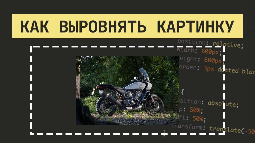
Let’s create our markup to work with.
Create a .wrap class and add an image with the .photo class inside it
<div class="wrap">
  <img
    src="https://images.unsplash.com/photo-1606421049683-c346eb99fafd?ixlib=rb-1.2.1&ixid=MXwxMjA3fDB8MHxlZGl0b3JpYWwtZmVlZHw2N3x8fGVufDB8fHw%3D&auto=format&fit=crop&w=500&q=60"
    class="photo">
</div>
Now move on to the CSS. Let’s set a fixed width and height for the block, and add a border for it – so we can see the borders of the element:
.wrap {
  width: 500px;
  height: 500px;
  border: 1px solid #000000;
}
And for the image itself, let’s set the width to 250px:
.photo {
  width: 250px;
}
This is what our markings look like now:

Markup is ready, now let’s move on to the options how you can align the image in the center of the block.
First option
Not perfect. We can add the .wrap class text-align:center; property, and then everything inside the block will be centered on the horizontal axis.
.wrap {
  width: 500px;
  height: 500px;
  border: 1px solid #000000;
  text-align: center;
}
.photo {
  width: 250px;
}
There is another way to center the image. To do this, translate it into a block element, and use
margin: auto; to center it:
.photo {
  width: 250px;
  display: block;
  margin: auto;
}
Next, we’ll move on to options that will allow us to align the image to the center of the block and align it vertically.
Second option
With display: flex we can center not only on the x-axis, but also on the y-axis. Let’s add the following properties to the .wrap class:
.wrap {
  display: flex;
  justify-content: center;
  align-items: center;
}
We will get the following situation:

And if we use the following code:
.wrap {
  width: 500px;
  height: 500px;
  border: 1px solid #000000;
  display: flex;
  justify-content: flex-end;
  align-items: flex-end;
}
Then we align the image along the horizontal axis to the right edge (justify-content: flex-end property), and with the help of align-items: flex-end; we align the image to the bottom edge.
Third option
The previous two options centered not only the image, but also any content inside the .wrap block, but the next option will only apply to the image.
.wrap {
  width: 500px;
  height: 500px;
  border: 1px solid #000000;
  position: relative
}
.photo {
  width: 250px;
  position: absolute;
  top: 50%;
  left: 50%;
  transform: translate(-50%, -50%);
}
These are the basic ways that will allow you to align the picture to the center of the block. If you find a more convenient way to accomplish this task, share it in the comments.
And if you still have questions, I advise you to watch the video, where I explain in details and show in action the above methods.
Очень полезные советы! И главное, просто и понятно! Спасибо!!!
Спасибо Вам большое за помощь. Не создала класс для элемента img. С помощью Вашей статьи получилось выровнять картинку по середине.