Keyframes are key points in the animation. Keyframes help us manage intermediate steps during the animation.
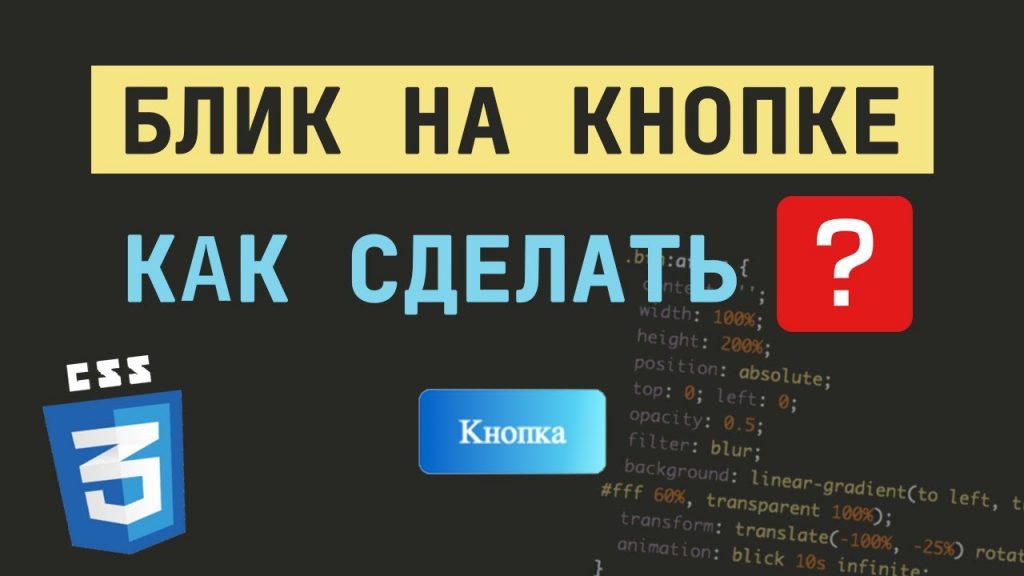
Button with flare: how to make an animated flare on pure CSS
Владимир Самойлов
Content:
In this article you will learn how to make an animated button flare. We will do it with CSS-animation, using keyframes. No JS, just HTML and CSS.
Now let’s do it in order. First, let’s create a button in HTML:
<div class="btn">Button with flare</div>
Then let’s add some styles to it in CSS:
.btn {
  display: inline-block;
  position: relative;
  color: #fff;
  font-size: 1.5rem;
  background: linear-gradient(to right, #0162c8, #55e7fc);
  padding: 1rem 1.75rem;
  border-radius: 0.5rem;
  overflow: hidden;
}
What did we do here and why? First, we wrote position: relative, because we are going to use a pseudo element (our flare) and it will have to take its parent (the button) as a reference point. Also we’ve set a linear gradient for the background, resized and colored the text, rounded the borders and added paddings. But most importantly, we added overflow: hidden – it means that everything that will go beyond this element will be hidden.
As a result, we got a button like this:

But it doesn’t have a flare yet. Let’s add it.
How will this be realized? We will create a pseudo element for which we will set CSS properties that will make it look like a flare. Then every five seconds we will run an animation which will move our pseudo element (flare). We will create a flare effect on the button this way.
Let’s get started.
Let’s create a :before pseudo element and write some CSS properties for it:
.btn:before {
  content: '';
  width: 100%;
  height: 200%;
  position: absolute;
  top: 0; left: 0;
  opacity: 0.5;
  filter: blur;
  background: linear-gradient(to left, transparent 0%, #fff 40%, #fff 60%, transparent 100%);
  transform: translate(-100%, -25%) rotate(10deg);
  animation: blick 5s infinite;
}
In the first lines we set the size and coordinates of our flare. It will be twice the height of the button and located on the left side. Next, we added a little blur and made it more transparent.
Pay attention to the background we prescribed. From 0 to 40% of the flare width (and it occupies 100% of the button width) the background will be transparent. Then from 40% of the width to 60% the background will be white. And accordingly from 60% to 100% of the width – the background will be transparent.
Using the transform property, we moved it outside of our button and also rotated it a bit.
And with the animation property we specified which animation we will apply to this pseudo-element. We also specify the time in which the animation should be done and set it to infinite, which means infinite animation.
Now it’s time to write the keyframes for the animation.
@keyframes blick {
  0% {
    transform: translate(-100%, -25%) rotate(10deg);
  }
  20% {
    transform: translate(100%, -25%) rotate(10deg);
  }
  100% {
    transform: translate(100%, -25%) rotate(10deg);
  }
}
Let’s go into more detail here.
We have set that our flare will start the animation being outside the button on the X axis (translate(-100%, -25%)). After 20% (20 percent of 5 seconds – 1 second), the flare (pseudo-element) will already be in its original position along the X axis (translate(100%, -25%)). This means that it will pass along our button in one second. And then it will freeze. That is the remaining 80% (or 4 seconds) it will be in a static position, but visually we will not see it. And then the animation repeats.
Finally, I want to remind you that I didn’t use prefixes for keyframes and other CSS properties. But you should not forget about them.
That’s all. I suggest you to watch the video, where I once again explain how to make an animated flare effect on the button.
Was the article helpful?
👍
Yes - 13
👎
Not - 3
Comments: